
QuoTrend
SignalsScreenerWatchlistNews
⌘K
QuoTrend
PAGEHome
SignalsScreenerWatchlistNews
ScreenerSignalsNewsSectorsHeatmapsInsiderCalendarStrategiesCompareCryptoForexFutures
HomePricingContactHelpTermsPrivacy
Quotes delayed 15 minutes for NASDAQ, NYSE and AMEX.
QuoTrend provides financial information and tools for educational purposes only — not investment advice or a recommendation to buy or sell. See our Terms.
© 2026 QuoTrend
On this page

Screen the market in seconds

A stock screener narrows the universe of public companies down to the ones that match a set of criteria you specify. The Screen page accepts more than 170 such criteria — combine any number of them (they're AND-ed together) and tune thresholds inline.

Overview

QuoTrend Screen's core features
  • Fundamentals, technicals, ownership and news in a single grid
  • Multiple views — Snapshot, Valuation, Financials, Performance, Technical, Charts, Heatmap and more
  • Instant re-screen as you change filters; saved screens for repeat use

Filters & criteria

Open the filter grid from the filters toggle on the Screen page. Any combination of filters can be stored as a Saved Screen and recalled from the dropdown next to the page title.

Descriptive filters

Exchange

Filters by listing venue. QuoTrend covers stocks listed on NASDAQ, NYSE and NYSE American (the exchange formerly known as AMEX).

Index

Limits results to constituents of a specific benchmark index — for example, the S&P 500, Dow Jones Industrial Average or Nasdaq 100. Useful for narrowing a universe to large-cap or sector-representative names.

Sector

Groups companies by their primary line of business. QuoTrend uses the 11 GICS sectors as the top-level classification.

Industry

A finer-grained classification within each sector, splitting companies by the specific products or services they sell.

Country

Where the company is headquartered. Selections include individual countries, regional bundles (Europe, Asia ex-Japan) and the BRIC grouping (Brazil, Russia, India, China).

Market Cap.

Stock price times shares outstanding. The standard yardstick for company size — used to bucket names into Mega / Large / Mid / Small / Micro caps.
Market Capital = Current Market Price × Number Of Shares Outstanding
Shares Outstanding = Total Number Of Shares − Shares Held In Treasury
Float = Shares Outstanding − Insider Shares − Above 5% Owners − Rule 144 Shares

Dividend Yield

Annual dividend per share, expressed as a percentage of the current price. Higher yields mean more cash returned per dollar invested — but watch the payout ratio and balance sheet to gauge whether the payout is durable. Falls back to the trailing-twelve-month figure when no forward estimate is published.
Dividend Yield = Annual Dividend Per Share / Price Per Share

Option/Short

Narrows results to names that trade options, can be shorted, or both.

Analyst Recommendation

Consensus rating across covering analysts. Scores aggregate to a 1-to-5 scale (1 = Strong Buy, 5 = Strong Sell), with Hold sitting at 3.0.
Rating Scale: 1.0 Strong Buy, 2.0 Buy, 3.0 Hold, 4.0 Sell, 5.0 Strong Sell

Earnings Date

Next scheduled earnings announcement for the company. Major-cap reports often move the broader tape on the day of release, so this filter is useful both for ducking volatility and for stalking it deliberately.

IPO Date

The date of the Initial Public Offering. Filters stocks that conducted their IPO within a specific time range (today, yesterday, this week, this month, this year, or custom ranges).

Target Price

Analysts' mean target price for the stock. Filter options range from “50% Above Price” to “50% Below Price.”

Fundamental filters

P/E

Current share price relative to trailing-twelve-month earnings per share. A lower ratio implies the market is paying less for each dollar of profit. Average P/E differs widely by sector, so compare names against their industry peers rather than against the broad market.
P/E = Current Market Price / Earnings Per Share (EPS)
EPS = (Net Income − Dividends On Preferred Stock) / Average Outstanding Shares

Forward P/E

Same construction as P/E, but uses analyst consensus EPS for the next fiscal year in the denominator. A forward P/E below the trailing P/E signals analysts expect earnings to grow.
Forward P/E = Current Market Price / Forecasted Earnings Per Share

PEG

Forward P/E divided by projected 3- to 5-year earnings growth. PEG aims to put valuation and growth on the same axis: a value of 1.0 implies you're paying one unit of P/E for every percentage point of expected growth.
PEG = (Forward P/E) / Annual EPS Growth

P/S

Market cap as a multiple of trailing revenue. Especially useful for early-stage names where earnings haven't yet emerged — revenue is at least there to anchor the multiple.
P/S = Current Market Price / Total Revenues Per Share

P/B

Market cap divided by shareholders' equity. A figure below 1.0 means the market values the company at less than the accounting net worth on its books — sometimes a true bargain, sometimes a sign that the book value itself is overstated.
P/B = Current Market Price / (Total Assets − Total Liabilities)
Book Value = (Total Assets − Total Liabilities) = Share Holder's Equity

Price/Cash

Share price relative to cash and equivalents per share. A low value can flag a balance sheet that's largely cash — useful when paired with enterprise-value-adjusted multiples.
P/C = Current Market Price / Cash per Share

Price/Free Cash Flow

Price relative to annual free cash flow per share. FCF screens out the accounting noise in earnings and shows how much real cash the business throws off, scaled to the share.
P/FCF = Current Market Price / Cash Flow per Share

EPS (ttm)

Net income allocated to each share outstanding over the trailing twelve months. EPS is the bedrock of most valuation work — it feeds P/E, PEG and almost every other earnings-based ratio in the screener.
EPS = Total Earnings / Total Common Shares Outstanding (trailing twelve months)
EPS Growth This Year = (EPS This Year − EPS Previous Year) / EPS Previous Year

EPS growth this fiscal year (GAAP)

Analyst consensus for EPS growth in the current fiscal year.

EPS growth next fiscal year (GAAP)

Analyst consensus for the fiscal year after the current one.

EPS growth past 5 years

Five-year compounded annual growth rate of trailing EPS.

EPS growth next 5 years

Long-term annualized EPS growth estimate (typically a 3–5 year horizon).

EPS growth qtr over qtr

Latest reported quarter's EPS versus the same quarter a year earlier.

Sales growth qtr over qtr

Latest quarter's revenue versus the same quarter a year earlier.

Sales growth past 5 years

Five-year compounded annual growth rate of revenue.

Dividend Yield (Fiscal Year Estimate)

Forward-looking version of the dividend yield, using consensus dividend estimates for the next fiscal year. Falls back to the trailing-twelve-month figure when no forward estimate is published.
Dividend Yield = Annual Dividend Per Share / Price Per Share

Return on Assets

Net income as a percent of total assets. Tells you how productively the company turns its asset base into profit — the higher the number, the more output management is squeezing out of every dollar on the balance sheet.
ROA = Annual Earnings / Total Assets

Return on Equity

Net income as a percent of shareholders' equity. The single most-watched gauge of how well a company compounds the capital its owners have left in the business.
ROE = Annual Net Income / Share Holder's Equity

Return on Invested Capital

Net operating profit (after tax) as a percent of total invested capital (debt + equity). Strips out the effect of capital structure to show whether the underlying business itself earns more than its cost of capital.
ROIC = Net Income / Invested Capital

Current Ratio

Short-term assets divided by short-term liabilities. A reading above 1.0 means the company has enough current resources on hand to cover what it owes within the year.
Current Ratio = Current Assets / Current Liabilities

Quick Ratio

Like the current ratio but stricter — inventory is removed from the numerator, leaving only assets that can be converted to cash quickly. A safer test of solvency for inventory-heavy businesses.
Quick Ratio = (Current Assets − Inventories) / Current Liabilities

Long Term Debt/Equity

Long-term borrowings as a multiple of shareholders' equity. Highlights how much of the long-term capital structure is funded by debt rather than owners — meaningful for evaluating refinancing risk.
LT Debt/Equity = Long Term Debt / Share Holder's Equity

Debt/Equity

Total liabilities relative to shareholders' equity. The broadest leverage measure; compare across industry peers, since capital-structure norms differ dramatically by sector.
Debt/Equity = Current Liabilities / Share Holder's Equity

Gross Margin

Share of every revenue dollar that survives after the direct cost of producing and shipping the product. Wider gross margins generally signal pricing power or low input intensity.
Gross Margin = (Total Sales − Costs) / Total Sales

Operating Margin

Profitability after both direct production costs and ongoing operating expenses are paid — but before interest and taxes. A useful focus for comparing core business efficiency across companies with different capital structures.
Operating Margin = Operating Income / Net Sales

Net Profit Margin

Bottom-line earnings as a percent of total revenue. The catch-all profitability number after every cost — operating, financial and tax — has been paid.
Net Profit Margin = Net Income / Revenues

Payout Ratio

Share of earnings paid out as dividends. Low payout ratios leave more room to reinvest or raise the dividend; very high ratios can signal a payout that's hard to sustain through a downturn.
Payout Ratio = Dividends / Earnings

Insider Ownership

Share of the company held by officers, directors and other insiders, expressed as a percentage of total shares outstanding.

Insider Transactions

Net change in insider holdings over the trailing period. Positive readings mean insiders bought more than they sold; negative readings flag distribution.

Institutional Ownership

Share of the company held by funds, advisors, banks and other reporting institutions, as a percentage of total shares outstanding.

Institutional Transactions

Net change in institutional holdings over the trailing period — typically derived from quarterly 13F filings.

Valuation models & yields

EV/EBIT

Enterprise value divided by earnings before interest and taxes. A capital-structure-neutral cousin of P/E that counts net debt in the price and operating profit (rather than net income) in the denominator, so it compares cleanly across companies with different leverage and tax rates. Lower is cheaper — a favorite multiple for screening cyclicals and acquisition candidates.
EV/EBIT = Enterprise Value / EBIT

EV/FCF

Enterprise value relative to free cash flow — the strictest of the EV multiples. It prices the whole business (equity plus net debt) against the actual cash it throws off after capital spending, so a low EV/FCF flags a genuinely cash-generative company trading cheaply.
EV/FCF = Enterprise Value / Free Cash Flow

Earnings Yield

The inverse of P/E, expressed as a percentage — how many cents of trailing earnings you get for each dollar invested. Stated this way it sits on the same axis as a bond yield, so value investors compare it directly against the 10-year Treasury to judge whether stocks are cheap. Higher is cheaper.
Earnings Yield = EPS (TTM) / Price × 100

FCF Yield

Free cash flow per share as a percentage of price — the cash-based answer to earnings yield. Because cash flow is harder to massage than reported earnings, a high FCF yield is one of the cleaner signals of real value.
FCF Yield = Free Cash Flow per Share / Price × 100

P/Tangible Book

Price relative to tangible book value — shareholders' equity after goodwill and other intangibles are stripped out. A stricter version of P/B preferred for asset-heavy and financial names, where intangibles can inflate the stated book value.
P/Tangible Book = Price / ((Book Value − Goodwill − Intangibles) per Share)

Graham Number

Benjamin Graham's back-of-the-envelope estimate of a defensive stock's maximum fair value, blending earnings and book value. A price below the Graham Number is the classic deep-value entry signal; the screener's Price/Graham ratio expresses how far above or below it the stock trades.
Graham Number = √(22.5 × EPS × Book Value per Share)

Peter Lynch Fair Value

Peter Lynch's growth-adjusted fair value, which prices a stock at a P/E equal to its earnings growth rate (a PEG of 1). A price under the Lynch Fair Value suggests the market is underpaying for growth; the Price/Lynch FV ratio shows the discount or premium.
Lynch Fair Value ⇒ Fair P/E = EPS Growth Rate (PEG = 1)

Average P/E (3Y / 5Y / 10Y)

The stock's own mean P/E over the trailing 3, 5 or 10 years. Comparing today's multiple against its long-run average is a fast mean-reversion check — a P/E well below its historical norm can flag a re-rating opportunity, or a structural de-rating worth investigating.

Financial health & quality scores

Altman Z-Score

A five-factor bankruptcy-risk model that folds working capital, retained earnings, operating profitability, leverage and asset turnover into a single solvency score. Convention: above 3.0 is the safe zone, 1.8–3.0 is the grey zone, and below 1.8 signals financial distress. A staple screen for steering clear of value traps.
Z = 1.2·A + 1.4·B + 3.3·C + 0.6·D + 1.0·E
A = Working Capital / Total Assets · B = Retained Earnings / Total Assets
C = EBIT / Total Assets · D = Market Cap / Total Liabilities · E = Sales / Total Assets

Piotroski F-Score

A 0-to-9 quality score that awards one point for each of nine pass/fail tests across profitability, leverage and operating efficiency. A score of 8–9 marks a fundamentally improving company; 0–2 marks a deteriorating one. Designed to separate the strong from the weak inside a basket of cheap stocks.

Interest Coverage

Operating profit divided by interest expense — how many times over a company can pay the interest on its debt out of earnings. Under roughly 1.5× is a red flag for default risk; comfortably above 3× is healthy.
Interest Coverage = EBIT / Interest Expense

Net Debt/EBITDA

Net debt (total debt minus cash) as a multiple of EBITDA — the leverage gauge credit-rating agencies and lenders watch most. Below roughly 3× is generally considered manageable; rising multiples signal balance-sheet stress.
Net Debt/EBITDA = (Total Debt − Cash) / EBITDA

Net Debt/Equity

Net debt relative to shareholders' equity — leverage measured against the owners' stake rather than against earnings. A negative reading means the company holds more cash than debt.
Net Debt/Equity = (Total Debt − Cash) / Shareholders' Equity

Net Debt/FCF

How many years of free cash flow it would take to retire net debt — a direct read on how fast a company could de-lever from its own cash generation.
Net Debt/FCF = (Total Debt − Cash) / Free Cash Flow

Net Cash %

Cash and equivalents minus total debt, as a percentage of market cap. A positive figure flags a net-cash balance sheet — common in deep-value and small-cap screens where cash is a big share of the price.
Net Cash % = (Cash − Total Debt) / Market Cap × 100

Return on Capital Employed (ROCE)

Operating profit as a percentage of capital employed (equity plus debt minus current liabilities). A capital-structure-aware quality gauge: it shows how efficiently the whole capital base — not just equity — is turned into operating profit.
ROCE = EBIT / Capital Employed

FCF Margin

Free cash flow as a percentage of revenue — the share of every sales dollar that converts to cash after capital spending. A high, stable FCF margin is one of the clearest marks of a durable, cash-generative business.
FCF Margin = Free Cash Flow / Revenue × 100

Shareholder returns & forward growth

Shareholder Yield

The total cash a company returns to shareholders — dividends plus net buybacks plus net debt paydown — as a percentage of market cap. A broader measure than dividend yield alone: it captures buyback-heavy companies that hand back cash without ever raising the dividend.
Shareholder Yield = (Dividends + Net Buybacks + Net Debt Reduction) / Market Cap × 100

Buyback Yield

The portion of shareholder yield that comes from net share repurchases — stock bought back, net of new issuance, as a percentage of market cap. Positive buyback yield shrinks the share count and lifts every per-share metric.
Buyback Yield = Net Share Repurchases / Market Cap × 100

Debt Paydown Yield

Net debt reduction as a percentage of market cap — cash used to retire debt, which accrues to equity holders by de-risking the balance sheet. The third leg of shareholder yield, alongside dividends and buybacks.

FCF Growth (5Y)

Five-year compound annual growth rate of free cash flow — a cleaner growth signal than EPS growth because it's built on cash rather than accounting earnings.

EBITDA Growth (5Y)

Five-year compound annual growth rate of EBITDA — operating-profit momentum before the noise of interest, tax and depreciation policy.

Forward Revenue Growth

Analyst-consensus expected revenue growth for the coming year, comparing the next forecast period against the same period a year earlier.

Forward EBITDA Growth

Analyst-consensus expected EBITDA growth for the coming year — a forward read on operating-profit momentum.

Target Price Upside

The percentage gap between the analyst consensus 12-month price target and the current price. Positive upside means the Street still sees room to run; screen for it to surface names analysts rate as undervalued.
Target Upside = (Avg Target Price − Current Price) / Current Price × 100

Number of Analysts

How many sell-side analysts cover the stock and feed the consensus estimates. Heavier coverage usually means more reliable consensus figures; very thin coverage flags under-followed names where a single voice can swing the numbers.

Technical filters

Performance

Trailing price return measured across several rolling windows. Each window counts only U.S. trading days — five for a week, twenty-one for a month, and so on, scaling up to 2,520 days for the ten-year option.
Performance 1 Week = Last 5 trading days
Performance 1 Month = Last 21 trading days
Performance 3 Months = Last 63 trading days
Performance 6 Months = Last 126 trading days
Performance 1 Year = Last 252 trading days
Performance 3 Years = Last 756 trading days
Performance 5 Years = Last 1,260 trading days
Performance 10 Years = Last 2,520 trading days

Volatility

Typical daily trading range, expressed as a percentage of price. Higher values indicate wider intraday swings — useful for sizing positions or screening for active-trading candidates.

RSI (14)

Compares the average size of up-day closes to the average size of down-day closes over a 14-day window, mapped to a 0-to-100 scale. Conventional cuts: below 30 = oversold (possible bounce setup), above 70 = overbought (possible pullback setup).

Gap

Percentage difference between today's open and the prior day's close. Gaps form when overnight news or order imbalances reprice the stock before the regular session starts.

Simple Moving Average

Trailing arithmetic mean of closing prices over a 20-, 50- or 200-day window. Used here to screen for prices trading above or below a chosen moving average — a basic trend filter.

Change

Daily price return — today's close versus yesterday's close, as a percent.

Change from Open

Today's close versus today's open, as a percent. Useful for screening intraday reversals where the day's drift differs from the prior-close move.

High/Low

Distance from the period extreme — pick a 20-day, 50-day or 52-week window, and the filter expresses where the current price sits relative to the highest high or lowest low in that window.

Pattern

Recognizable shapes that price traces on a chart over time (head-and-shoulders, wedges, channels, etc.). Filter by pattern to find names whose chart geometry matches a specific setup.

Candlestick

Recognizable single-bar or multi-bar candle shapes that signal indecision, exhaustion or continuation (doji, engulfing, morning star, etc.). Filter by candle pattern to find names whose most recent bars match a specific formation.

Beta (5 Years)

Slope of the regression of monthly stock returns against the broad-market index over the last 60 months. A beta of 1 moves in lockstep with the market; above 1 amplifies the market; below 1 dampens it; negative readings move inversely. Useful for portfolio-level risk targeting.

ATR

Average True Range over 14 days, expressed in price units. The “true range” for a bar is the larger of today's high-minus-low or the distance from today's extreme to the previous close (whichever spans more) — ATR averages that across 14 bars, so it captures volatility including gap moves between sessions.
True Range = max(high, closeprev) − min(low, closeprev)

Short Float

Outstanding short interest as a percentage of the float. A high reading signals either bearish positioning or a setup primed for a short squeeze, depending on context.

Average Volume

Mean daily share volume over the past three months. The denominator for relative-volume calculations.

Relative Volume

Today's volume, intraday-adjusted, scaled against the 3-month daily average. Values above 1.0 mean above-normal trading activity.
Relative Volume = Current Volume / 3-month Average Volume

Current Volume

Shares traded so far today (or during the most recent completed session).

Price

Latest trade price, or the closing print of the most recent session.

Other data

Other stock data included in the Screen page's views, and stock's detail.

Shares Outstanding

The total number of common shares currently owned by the public.
Shares Outstanding = Total Number Of Shares − Shares Held In Treasury

Shares Float

The total number of shares available to trade by the public.
Shares Float = Shares Outstanding − Insider Shares − Above 5% Owners − Rule 144 Shares
Heads up
Screens with more than 12 active filters can take 2–3 seconds to evaluate. Save the result if you'll revisit it — saved screens hit a precomputed index and load instantly.

Saved screens

Any combination of filters can be saved as a reusable preset. Free plans keep up to 50 saved screens; Premium lifts that to 200. Access them under Saved Screens in the Account page, or from the preset dropdown on the Screen page header.

Sharing a screen

Every screen has a stable URL — copy-paste it into Slack or an email and the recipient lands on the exact same view (read-only if they're not signed in).

Views & columns

Each view rearranges the same result set for a different task. Switch with the view tabs at the top of the table:
  • Snapshot — one-line summary, the default.
  • Financials — quarterly EPS, revenue, margins.
  • Performance — returns over 1D/1W/1M/3M/YTD/1Y.
  • Custom — pick exactly the columns you want. Saved per screen.

Data sources

For data update cadence and delays, see the FAQ.

Screen signals (event lists)

These are quick, pre-computed lists on the Screen page — daily snapshots of stocks meeting one condition (52-week highs, oversold by RSI, recent upgrades, etc.), recomputed live on every Screen page load. For the QuoTrend Signals product — backtested setups with a track record — see Signals under QT Tools.

Top Gainers — Largest percent gainers since yesterday's close. (Top 200)

Top Losers — Largest percent losers since yesterday's close. (Top 200)

New High — Stocks that printed a fresh 52-week high today. (Top 200)

New Low — Stocks that printed a fresh 52-week low today. (Top 200)

Most Volatile — Widest intraday high-low ranges today, scaled by price. (Top 200)

Most Active — Highest absolute trading volume today. (Top 200)

Unusual Volume — Largest gap between today's volume and the 3-month daily average. (Top 200)

Overbought — Names whose 14-day RSI is currently above 70 — a setup that often precedes a pause. (Top 200)

Oversold — Names whose 14-day RSI is currently below 30 — a setup that often precedes a bounce. (Top 100)

Downgrades — Tickers with at least one analyst downgrade today.

Upgrades — Tickers with at least one analyst upgrade today.

Earnings Before — Companies scheduled to report earnings today before the open.

Earnings After — Companies scheduled to report earnings today after the close.

Major News — Tickers with the most fresh news items today — useful for stalking event-driven moves. (Top 40)

Chart Patterns — Stocks whose current bars sit at or near a recognized chart pattern. (Top 100, ranked by pattern strength)

On this page

Technical Analysis

Technical analysis is the practice of forecasting future price action from the historical record of price and volume itself — without modelling the underlying business or its fundamentals.

Whereas fundamental analysis values a company by looking at its earnings, balance sheet and competitive position, technical analysis works one level removed. It asks a narrower question: given the way price has behaved so far, what is it likely to do next? The answer comes from the chart itself rather than from financial statements.

Two broad toolkits do most of the work. Chart-pattern recognition looks for repeated geometric shapes that price traces over time — wedges, channels, head-and-shoulders, double tops and the like — and trades the moments when those shapes resolve. Statistical indicators reduce price and volume to a single derived series (moving averages, oscillators, momentum gauges) and trade the crossovers, divergences and extremes those series produce.

Both toolkits rest on the same three premises, spelled out below.

The three premises

1. Prices move in trends

Once an uptrend, downtrend or sideways range establishes itself, it tends to persist until something shifts the supply-demand balance. Most technical entries are built around either following a trend that is already in motion or stepping in at the moments when a trend is exhausting and reversing.

2. Price discounts everything

Every piece of public information — earnings, macro data, sentiment, insider activity — gets reflected in the price the moment it's known. Reading the chart is therefore a shortcut to reading the collective interpretation of all that information by everyone trading the name right now.

3. History repeats itself

The patterns that show up in price are ultimately patterns in mass psychology: fear, greed, capitulation, euphoria. Because human reactions to similar setups recur with broadly similar shape, the same chart formations appear over and over across decades and across asset classes.

Caveats

Technical analysis is interpretive. Two careful analysts can look at the same chart and read it differently — most indicators have tunable parameters, multiple oscillators can disagree with each other, and every pattern admits exceptions. None of the tools listed in this section produce mechanical buy-or-sell answers; they produce conditional signals that have to be combined with context and risk management.

A related critique is that widespread use of certain technical signals creates a degree of self-fulfilling behaviour: enough participants watching the same 200-day moving average will, between them, defend or breach it more decisively than the underlying setup would predict in isolation. That dynamic cuts both ways — it makes the signals louder, but also more prone to crowded false breaks.

On this page

QT Tools

QuoTrend ships a handful of proprietary tools that turn raw market data into decisions: a composite score per stock, a set of curated screens, a what-if simulator for economic releases, and a diagnostic X-ray for any portfolio.

QT Score

QT Score is a single 1–99 rating that measures how strongly a stock is performing — its price strength relative to the rest of the market — reinforced by its growth and underlying quality. A higher score means a stronger, better-performing stock. It blends four factor groups, each scored 0–100, with momentum the lead driver.
  • Momentum — relative strength: how the stock's price performance ranks against the whole market across recent windows. The largest driver of the score.
  • Growth — historical and forecast growth of earnings and revenue.
  • Quality — profitability, balance-sheet health, capital efficiency.
  • Valuation — how cheaply the stock trades against its fundamentals.

How to read it

Each stock falls into one of four buckets, ranked by where its score sits against the whole live universe (a relative ranking, so the buckets re-balance as the market moves). Hover over the badge anywhere it appears to see the four sub-scores broken out.
  • Leader — the top 10% of scores. Among the market's strongest performers, with supporting fundamentals.
  • Strong — above-median (50th–90th percentile). Solid relative strength; check which sub-score leads.
  • Steady — below-median (10th–50th percentile). Mixed — strong on one factor, soft on another.
  • Laggard — the bottom 10%. Weakest on price and the supporting factors; often beaten-down or out-of-favor names.

Where it appears

The QT Score badge appears on the Screen page (as a sortable column and filter), every Quote page header, the Signals board, your Watchlist and Dashboard, Sectors rows, and the Compare page snapshot. The sub-scores are visible on hover everywhere.
Not a recommendation
QT Score is a quantitative, momentum-led summary of how a stock has been performing — not a forecast of where it goes next. It doesn't factor in news or your own risk tolerance, and a strong performer can also be more volatile. Treat it as a starting filter, not a buy signal.

Signals

A signal is a rule-based setup we detect on a stock — a catalyst, a chart or candlestick pattern, a rating change, or a shift in sentiment — matched against every comparable case in roughly 20 years of history. The Signals boardis the live daily feed of what's firing now; “Today's signals” on the home page is the short list of the strongest ones.

The four families

  • Catalyst — a corporate event: an earnings beat or miss, insider buying or selling, an analyst change.
  • Price-action — a chart or candlestick pattern: a gap, a channel, a wedge, a reversal.
  • Rating — a move in the QT Score, an analyst upgrade, or a bullish drift in the overall sell-side consensus (analysts collectively turning more positive over the past month).
  • Sentiment — positioning and crowd mood, such as a short-squeeze setup.

What each signal shows

  • Direction — bullish (historically followed by gains) or bearish (historically followed by declines). We show both.
  • The “why” — a one-line explanation of what triggered it.
  • Magnitude — where past cases of this exact signal landed over the next 20 trading days, shown as the full distribution of outcomes with the sample size, the median, and how often it was positive. It's a historical distribution, never a forecast of this stock.
  • QT Score — the quality stamp on the company behind the signal (see QT Score above).

Promoted vs informational

Some signals are “promoted” — they cleared a backtest bar across multiple market regimes (survivorship-corrected, with delisted companies included). Others are shown for information only. We only promote the ones the evidence supports, and we publish the misses too.

Track record

The “Where recent signals actually landed” section on the Signals board is a factual record of recently closed signals — wins and misses — each measured 20 trading days after it fired.

Free vs Premium

Every ticker, name, direction and QT Score is free, daily. Premium unlocks the full magnitude distribution and the “why” on every signal, plus signal alerts.

Signal alerts

Premium members can get a once-a-day digest when a signal fires on a ticker, a watchlist, a family, or all signals — by email or Telegram. Set them up under Account → Alerts → Signals.
Not advice
Signals describe historical patterns and statistics — educational information, not investment advice or a recommendation to buy or sell. Past patterns don't guarantee future results.

QT Strategies

QT Strategies are six curated screens, each expressing a single investment thesis as a stack of filters. Open Strategies to see the hero card and full grid; click any strategy to load its matches into the Screen page. Match counts refresh every trading day.
  • QT Momentum — stocks in healthy uptrends with positive momentum across multiple periods, without being overbought.
  • QT Value — names trading at undemanding multiples (P/E, P/B, EV/EBITDA) while still showing solid fundamentals.
  • QT Dividend Safe — steady dividend payers with sustainable payout ratios, consistent growth, and durable cash flows.
  • Double-Buy — stocks getting two bullish signals at once: insiders buying while analysts upgrade, with fresh news coverage.
  • QT Turnaround — beaten-down names showing early signs of reversal — oversold technicals against improving fundamentals.
  • QT Compounder — high-quality, long-term growers with strong returns on capital and safely-leveraged balance sheets.

How to use them

Use a strategy as a starting universe, then add your own filters on top — sector, market cap, country, or any fundamental constraint. Saving the result keeps the strategy filters plus your additions as a reusable preset.

Impact Simulator

The Impact Simulator answers a what-if question on the economic calendar: given a hypothetical Actual reading for an upcoming release, how have SPY, QQQ, TLT and DXY historically reacted to comparable surprises?

How to read a scatter panel

Each of the four panels (SPY, QQQ, TLT, DXY) is the same chart with the same axes:
  • X-axis (-3σ to +3σ) — how much the actual release surprised vs. the consensus expected value, measured in standard deviations. 0σ = the print matched expectations. +1σ = the print came in one standard deviation hotter than expected. -1σ = one standard deviation cooler.
  • Y-axis (%) — the instrument's percent price change over the chosen window (1 hour, 1 day, or 1 week post-release).
  • Each dot — one historical release event. Its X position is that release's surprise magnitude; its Y position is how the instrument actually moved.
  • The colored line — summarizes “on average, what reaction does this instrument show per σ of surprise?”
  • The highlighted point — sits on the colored line at your slider's σ value. It's the model's predicted reaction if the next release prints at that surprise level.
  • N RELEASES — the sample size feeding the fit. Small samples (n < 20) make the line sensitive to outliers; treat the prediction as illustrative, not authoritative.

Reading the example: SPY at +1σ for an inflation print

You drag the slider to +1σ on the SPY panel for, say, Core Inflation Rate YoY. The dialog says: “if this CPI release comes in 1 stdev hotter than consensus, the {n} historical episodes with comparable surprises produced an average SPY reaction of X%over the chosen window.” The footer pill spells out the same X% plus a hit-rate caption — e.g. (n=10, 60% negative)means 6 of those 10 episodes produced a negative SPY day. The footer's 2×2 grid runs the same calculation for QQQ, TLT, and DXY so you can compare risk-on / bond / dollar reactions side-by-side.

Controls — and what they're actually for

  • σ slider— sets your hypothetical surprise. The thumb's position is rendered in the slider header both as the implied Actualvalue (in the release's native units) and as the equivalent σ offset from Expected. Drag to explore different what-ifs; charts and footer pills update in real time.
  • Window selector (1 Hour / 1 Day / 1 Week) — picks which post-release reaction window the scatter and predictions use. Knee-jerk reactions in the first hour can look very different from where the dust settles a week later, so flip between them to see how persistent the move was historically.

Where to find it

On the Calendar, click the “Simulate” chip on any row that has one — a small teal pill in the Impact column. The full set of supported releases is curated based on market relevance.
What “surprise” means
One σ is the historical standard deviation of (actual − prior) for that release. So a slider value of +1σ means “the print came in one standard deviation above the prior reading” — about as big as a typical surprise.
Illustrative, not predictive
Historical reactions don't guarantee future ones — a scatter cloud is a distribution, not a forecast. Use the simulator to understand asymmetry and typical magnitudes, not as a trading signal.

Portfolio X-Ray

Portfolio X-Ray is a four-panel diagnostic that tells you what your portfolio is actually exposed to — beyond the obvious list of tickers. It renders inline on the Portfolio page for whichever portfolio is active.

Concentration Risk

A donut chart of your top positions plus a roll-up of everything else. The Herfindahl-Hirschman Index (HHI) translates the spread into a single number; a band label (diversified / moderate / concentrated) puts it in context. A red callout fires when any single position exceeds 25% of the portfolio.

Factor Exposure

A six-axis radar — Value, Growth, Momentum, Quality, Size, Low Volatility — comparing your portfolio against a chosen benchmark (SPY, QQQ, or DOW). Below the radar, a delta table calls out the largest tilts in either direction.

Asset Mix

A stacked bar showing how your value splits across asset classes (Stocks, Stock ETFs, Bonds, Commodities, Real Estate, Cash, Other), followed by a stock-sector sub-breakdown so equity-heavy portfolios still get a legible sector view.

Risk Profile

Four KPI tiles — weighted-average beta, annualized volatility, correlation to the chosen benchmark, and the number of holdings. Colored by sign and threshold so high-beta or high-correlation portfolios surface immediately.
Use it to decide what to rebalance
The X-Ray flags concentration and tilt — it doesn't prescribe trades. Pair it with the Compare page to test what a swap would do to your factor exposure before executing.
On this page

Stock market, at a glance

Market maps visualize thousands of tickers at once. Rectangle size = market cap; color = performance. Hover for ticker detail.

What is a heatmap?
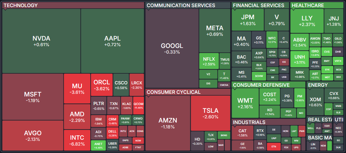
Market maps represent a popular form of visualization that allows browsing, searching and analyzing large amounts of stock data. Each stock is represented by a rectangle whose size corresponds to the company's market capitalization. Colors indicate performance — green for gains, red for losses, with more saturated colors indicating larger moves.
S&P 500 heatmap

Map types

QuoTrend offers the following map views. Switch between them via the dropdown above the canvas:
S&P 500
500
500 components, sector-grouped.
Dow Jones 30
30
30 Dow components, no grouping.
Nasdaq 100
100
Tech-heavy NDX components.
Russell 2000
2,000
Small-cap universe.
All Stocks
Thousands
Every covered ticker.
Market Cap
5 tiers
Grouped by size — Mega / Large / Mid / Small / Micro.
ETFs
~1,500
Funds grouped by category.
Crypto
Crypto
Cryptocurrencies grouped by category.
Themes
Themes
Investment themes (AI, Clean Energy, etc.).

Color scale

Green for gains, red for losses. Saturation maps to magnitude: ±0.5% faint, ±5% saturated. Black/grey for tickers with no move (or no data).

Navigation

  • Hover — shows a stock's 3-month price chart and main competitors.
  • Double-click stock — opens the full quote page.
  • Double-click sector/industry — opens the Screen page filtered to that group.
  • Zoom — use mouse wheel or the +/− controls to zoom in and out.
  • Pan — click and drag to move around the map.
  • Sidebar search — type a ticker to locate it on the map.
  • Data Type dropdown — switch the coloring metric without leaving the map.

Data types

Each map can be colored by a variety of data types including performance metrics (1 Day, 1 Week, 1 Month, 3 Months, 6 Months, 1 Year, YTD, 3 Year, 5 Year, 10 Year), valuation multiples (P/E, Forward P/E, PEG, P/S, P/B, EV/EBITDA, EV/Sales), growth rates, dividend yields, relative volume, short float, and analyst recommendations.
On this page

See where capital is flowing

The Sectors page rolls up market data by sector, industry, country or cap tier. Each row is the combined activity of every ticker that matches — useful for spotting rotation without drilling into individual names.

Overview

The Sectors page gives you aggregate market data rolled up by sector, industry, country, or market-cap tier. Each row represents the combined activity of every stock that matches that category — a quick way to see where capital is flowing without drilling into individual tickers.

Slicing dimensions

Four slicing dimensions are available:
Sector
11 GICS sectors
Technology, Healthcare, Financials, etc.
Industry
80 sub-categories
Granular sub-categories within each sector.
Country
11 markets
Geographic location of company HQ. Coverage expands as we add European, Asian and Latin American markets.
Cap tier
5 tiers
Mega ($200B+), Large, Mid, Small, Micro.

Views

Multiple view tabs are available for each slicing dimension:
  • Overview — Market Cap, P/E, Forward P/E, PEG, P/S, P/B, Dividend Yield, Analyst Recommendation, Volume, Change, and number of stocks.
  • Valuation — P/E, Forward P/E, PEG, P/S, P/B, Price/Cash, Price/FCF, and EPS/Sales growth rates.
  • Performance — Weekly, monthly, quarterly, semi-annual, annual, and YTD performance plus volume metrics.
  • Financial — Dividend Yield, ROA, ROE, ROI, liquidity ratios, debt ratios, and margin metrics.
  • Custom — Select any combination of columns to create your own view.
  • Performance Chart — Horizontal bar charts comparing categories across 7 time periods.
  • Charts — Line charts showing 1-year performance for each category with SMA 50 overlay and volume.
  • Heatmap — Treemap showing categories as tiles sized by market cap and colored by the selected metric.

How rollups work

Valuation metrics (P/E, P/S, P/B, etc.) are calculated as market-cap-weighted averages to prevent small companies from disproportionately affecting category-level values. Performance and financial metrics use simple averages. Volume and market cap figures are summed across every stock in the slice.

Sorting & navigation

All table columns are sortable in ascending or descending order. Clicking any category name navigates to the Screen page pre-filtered for that slice, so you can quickly drill down into the individual stocks that drive the aggregate numbers.
Topics

Frequently asked questions

Pick a topic on the left, or search above. If you don't find an answer, the contact panel below routes straight to a human.

Subscriptions
Becoming a subscriber, trials, plan changes.
Data & tickers
Coverage, update cadence, historical data.
Billing
Refunds, payment methods, plan switching.
Not found what you were looking for?
Talk to a human.
Describe the problem and the page where you hit it — we'll get back to you within 4 trading hours.
Contact us